

Intro
I joined at concept stage as the sole designer and spent four years designing the whole platform: online bookings, clinical workflows, payments, compliance reporting, the design system, and the new branding.
What I did
Product Designer | UX Strategy | UI Design | Branding
The Goal
Create a platform that adapts to the entire Australian Immunisation System — whether it’s used by local councils, general practices, school programs, or mobile health teams — while making complex healthcare delivery feel simple, fast, and accessible.
The problem I was solving
Immunisation providers were drowning in admin. A single vaccination session meant re-keying patient details, checking eligibility by hand, capturing consent, and reporting to the Australian Immunisation Register (AIR) — across disconnected tools and paper. For clinic staff, one session’s records could take around 40 minutes. Multiplied across hundreds of patients a week, admin — not care — was the real cost of running a service.
The brief I set myself: a clinician under time pressure should never have to re-enter known information, second-guess an eligibility rule, or leave the flow to check a regulation.
Decision 1 — Kill the 40-minute workflow
I rebuilt the core session flow around three moves:
- Cut and pre-fill. Every field had to justify its existence or go. Known data pre-filled; input order was rebuilt to match how clinics actually work, not how the database was structured.
- Automate, but stay visible. The system took over transcription and AIR reporting — but the interface always showed clinicians what had been done on their behalf. In clinical settings, silent automation destroys trust.
- One continuous flow. Eligibility, consent, administration, and reporting became a single path with no detours.
Result: the 40-minute process dropped to under 3 minutes. Providers told us this workflow was a key reason they adopted the platform.
Decision 2 — Make an automated eligibility engine trustworthy
Vitavo built the world’s first Immunisation Eligibility Engine — it draws on 30+ data points from a patient’s profile (demographics, indigenous status, medical conditions, birth weight and gestation, vaccination history, location of service) to automatically determine which vaccines someone is eligible for, and when.
The automation was the engineering achievement. My job was making its output something a clinician could trust:
- It suggests; it never silently decides. The engine proposes eligible vaccines and timing — the clinician stays in control and confirms.
- Every suggestion is inspectable. A clinician can see why a recommendation appeared: which profile data and which rules produced it.
- Missing data shows as a visible gap, never a confident-looking guess.
This was the hardest and most rewarding design problem on the platform: turning a dense, rules-heavy engine into something that feels clear and safe at the point of care.
Decision 3 — A design system built to outlive me
As the only designer on a growing platform, the design system wasn’t a luxury — it was how the product could scale without me in every room. I built the component library on design tokens, documented to WCAG 2.2 AA, and structured it so engineers could implement consistently on their own.
When Vitavo later expanded into new service lines — workplace and diagnostics — those products shipped on the same system.
How I worked
As the sole designer, I worked closely with the founder, the React engineers, clinicians, and QA testers throughout. There was no formal research budget or timeline — instead, insight came directly from the platform’s three user types: patients, admin staff, and immunisation nurses. Their feedback was continuous, and it shaped the product far more than any one-off study could have.
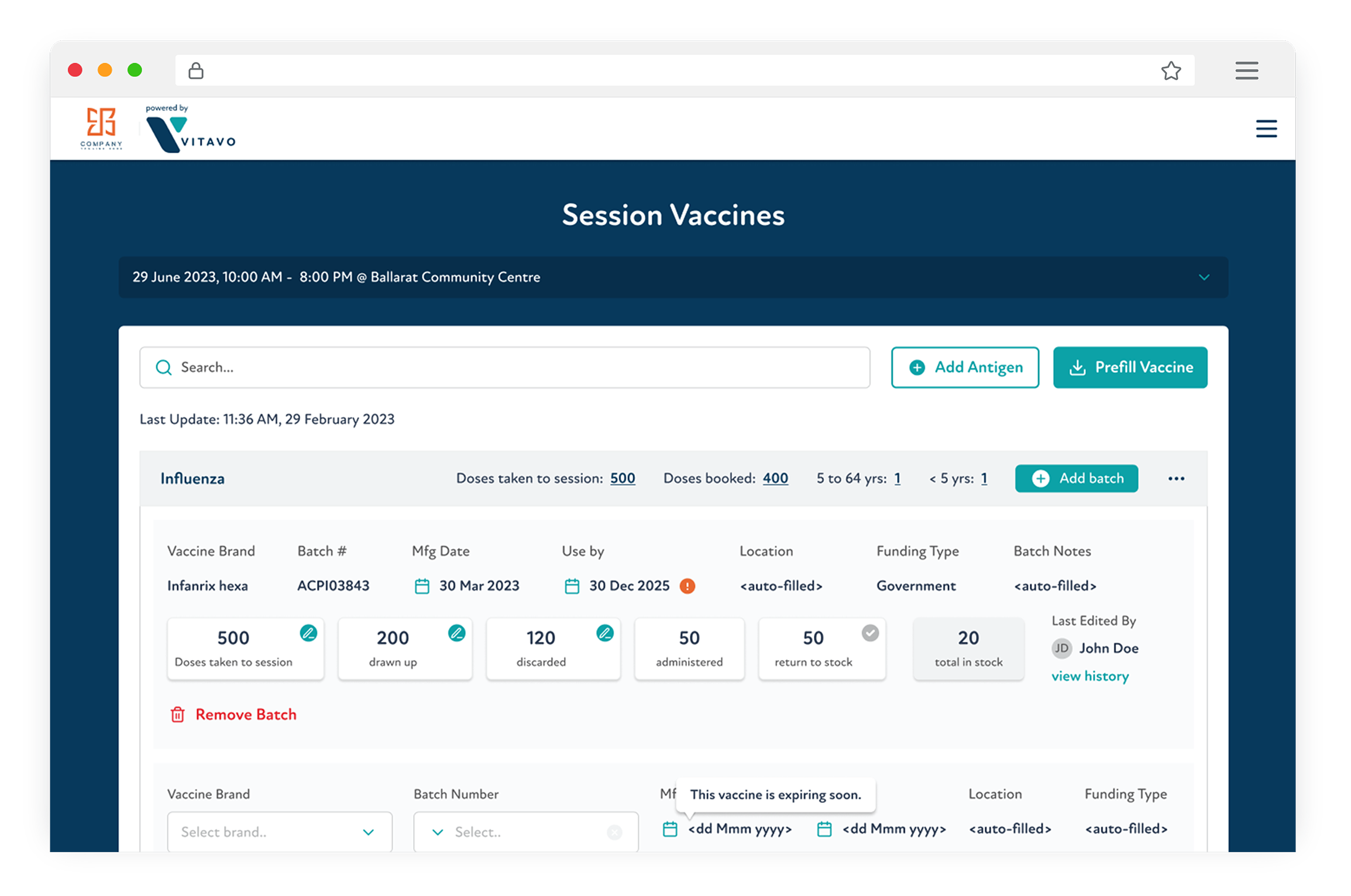
One decision I remember clearly: how to display large, dense data sets like vaccine inventory and full patient profiles. Engineering initially leaned toward showing everything at once, but I pushed back — it meant slow, heavy load times and a real cognitive burden on clinicians who were already working under pressure. We resolved it the way we resolved most things: by going back to what we were hearing from users. The answer was progressive disclosure — surface what matters first, let people drill into the rest on demand. It kept the interface fast and calm without hiding anything clinicians needed.
Core UX Features
Smart Booking & Eligibility
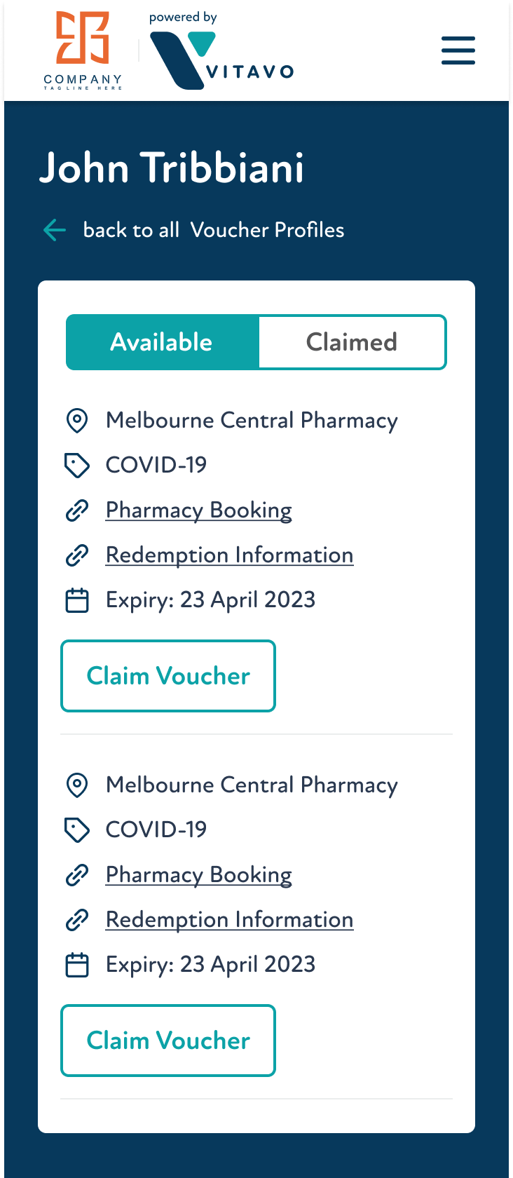
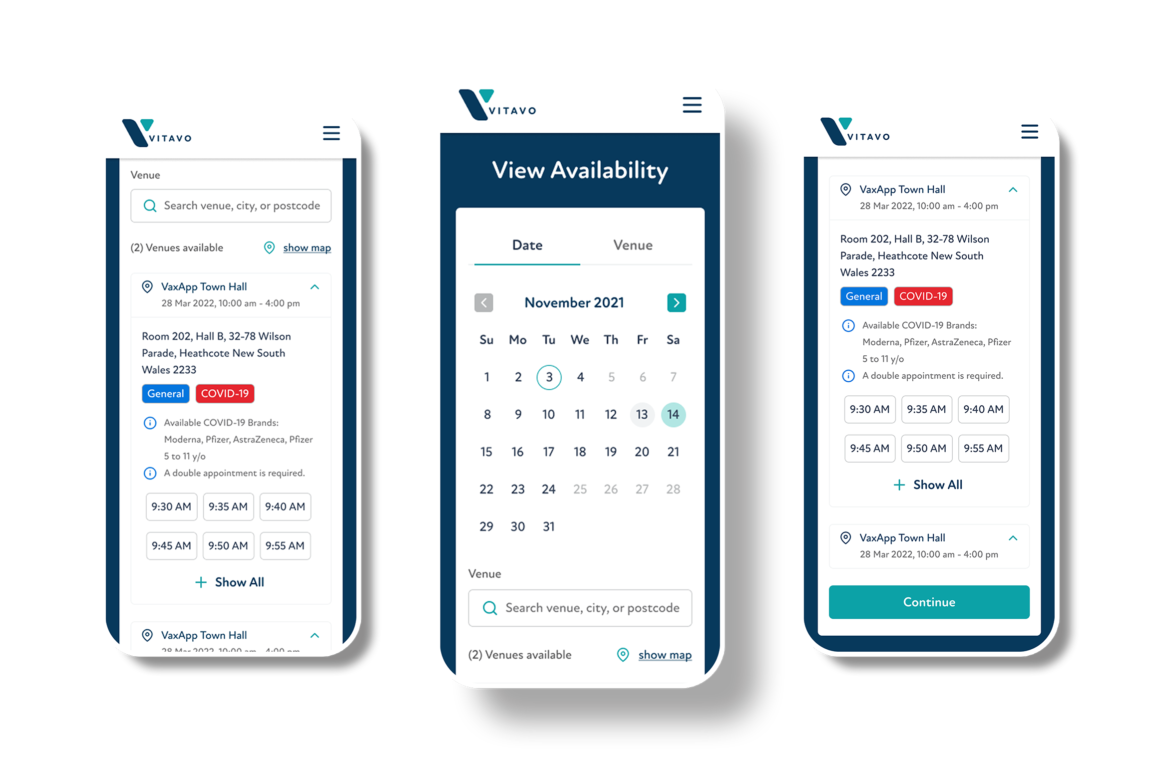
A dynamic booking flow that adjusts to age, vaccine type, and program rules — ensuring fast, compliant scheduling.
Workflow Automation
Streamlined admin tasks and clinical steps for faster, error-free sessions — even in high-volume settings.
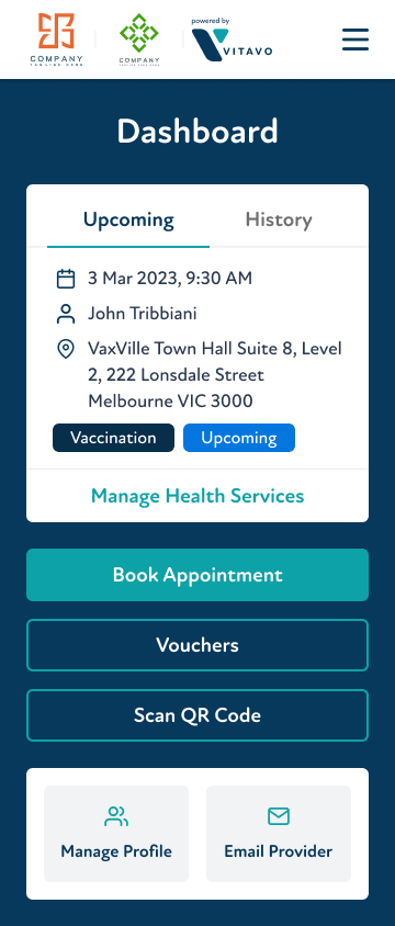
Real-Time Dashboards
Clear, actionable insights into vaccine uptake, session performance, and stock levels.
Notifications & Alerts
Proactive alerts for missing data, eligibility issues, or capacity limits — reducing risk and delays.
Outcomes
3
40-minute manual process → under 3 minutes
30
30+ providers — including City of Melbourne, City of Logan, and other councils, plus pharmacies, schools, and GPs
1
World's first Immunisation Eligibility Engine (30+ data points) — UX designed end-to-end
90
Later workplace product cut manual data entry by 90%+
Schools platform recognised with a 2023 GSK Immunisation Award (Public Health Association of Australia)
Real-time AIR + PRODA integration
for automated compliance reporting
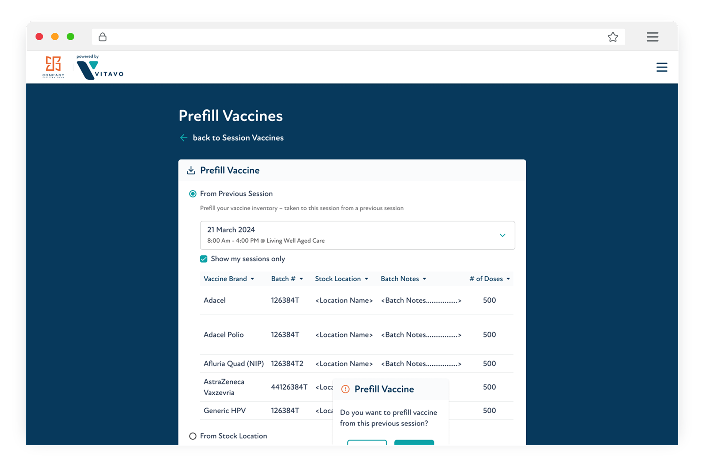
UI & Visual Language
Vitavo’s design supports clear, confident decisions under pressure. Using neutral greys with accents of bright teal for guidance, soft coral for urgency, and deep navy for emphasis, the interface is calm, focused, and accessible across local governments, clinics, and workplaces.
The product voice is equally clear and instructional, guiding users with concise messages like:
- “Eligibility confirmed.”
- “Next patient ready.”
- “Consent form incomplete – action required.”
Together, the visual and verbal tone create an intuitive, reassuring experience for high-stakes workflows.
Deep Navy
#07395C
Bright Teal
#0CA2A7
Soft Coral
#FC8484
WHAT I LEARNED
Working on a live national healthcare system meant design decisions had real consequences — for patients, for clinicians, for compliance.
I learned that in high-stakes workflows, the most important design choice is often what to remove. Every screen had to earn its place. Clarity wasn’t a preference; it was a safety requirement.