
Intro
I led the Mirage Property website project as both Project Manager and UI/UX Designer. I worked directly with the client to understand requirements, define priorities, gather feedback, and guide the project through delivery, while collaborating closely with our engineering team throughout implementation.
The challenge was to turn a large and varied property portfolio into an experience that made it easier for people to discover, narrow down, and evaluate properties based on what mattered to them.
What I did
Project Manager | UI/UX Designer | UX Strategy | Information Architecture | Responsive Web Design
The Goal
Create a modern property discovery experience for Qatar’s real estate market.
Design a website that helps people easily search, explore, compare, and enquire about properties while showcasing Mirage Property’s full range of real estate services.
As both Project Manager and UI/UX Designer, my goal was to translate the client’s business vision into a product experience that was intuitive for customers, technically feasible for development, and scalable as the property portfolio grew.
The Challenge
Property search is inherently complex. People arrive with different priorities: location, budget, property type, number of bedrooms, or whether they want to buy or rent. Every listing contains a significant amount of information, and users often compare multiple properties before making a decision.
The challenge was not simply to display listings, but to create an experience that helped users narrow a large set of possibilities into a manageable shortlist without making the search itself feel overwhelming.
Decision 1 — Make search the starting point
I worked directly with the Mirage Property team to understand their business goals, customer journey, and functional requirements for the new website. Throughout the project, I gathered feedback, refined the experience with the client, and translated those requirements into user flows and interface decisions while coordinating closely with the engineering team through implementation.
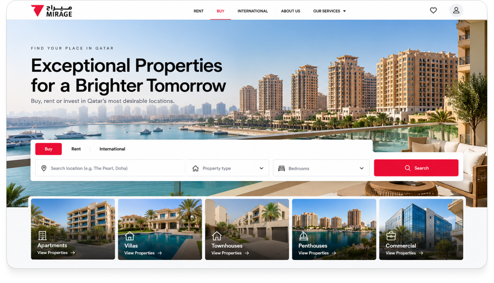
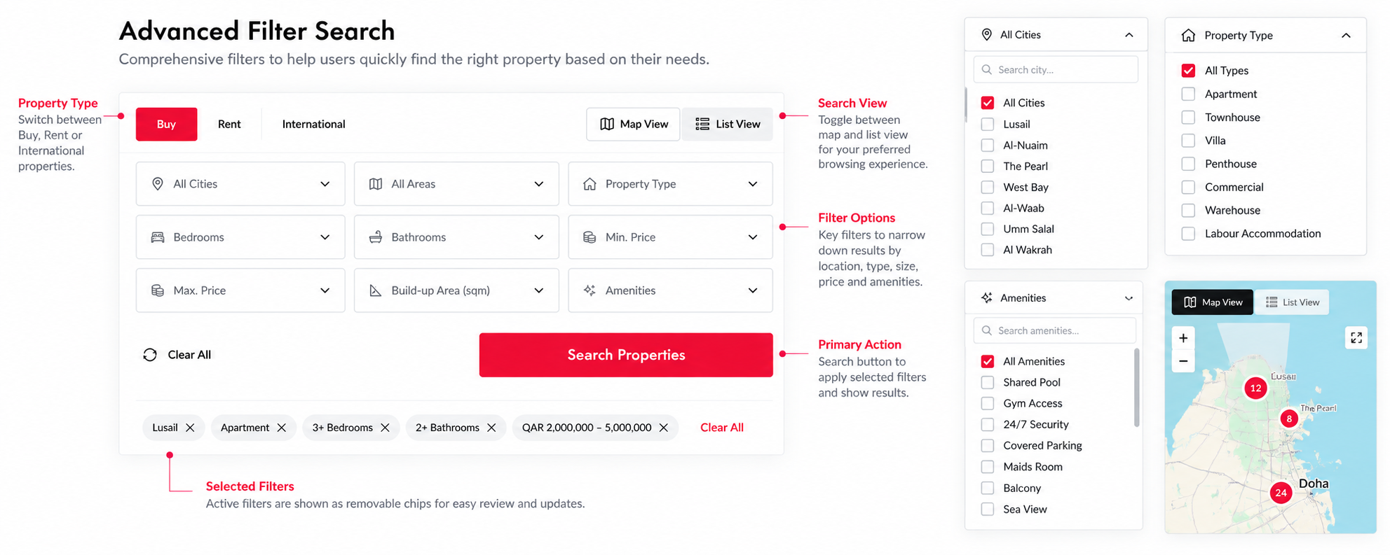
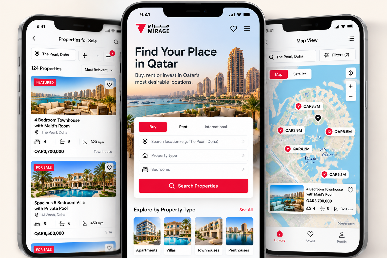
The search experience needed to support different ways people look for properties. Some users begin with a specific location, while others start with a budget, property type, or number of bedrooms.
Instead of forcing everyone through a single browsing path, I designed the experience around the criteria users naturally use to narrow their options. Search and filtering became the foundation of the product, allowing users to progressively refine a large property inventory into a smaller set of relevant results.
The principle was simple:
Start broad. Narrow quickly. Explore what matters.
Decision 2 — Design listings for scanning, not reading
Property seekers rarely evaluate one listing in isolation.
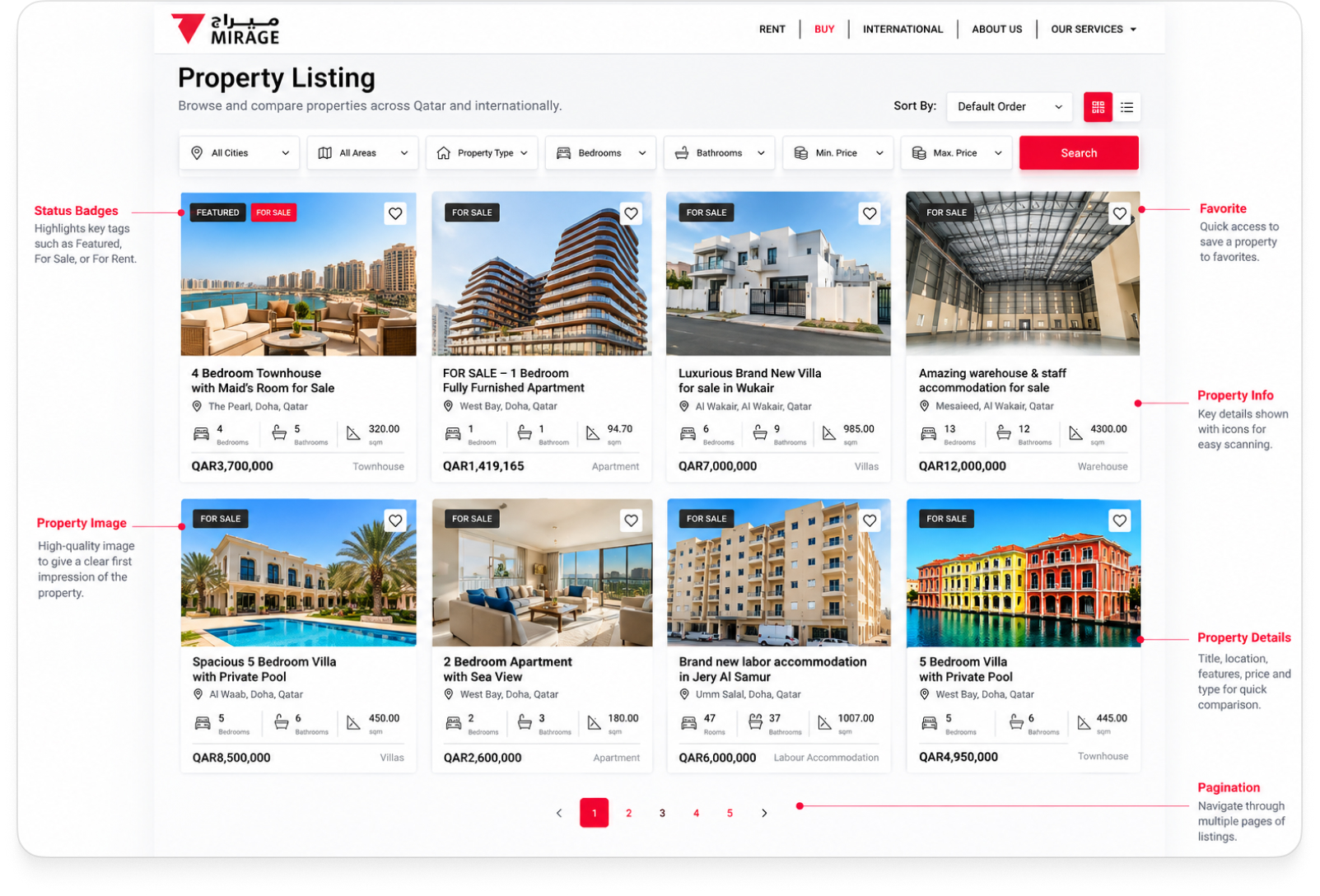
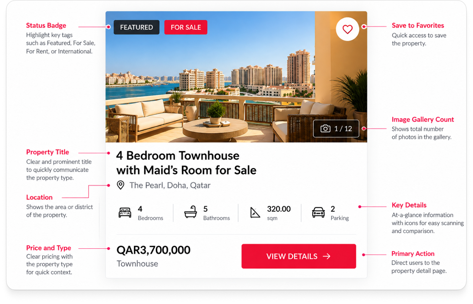
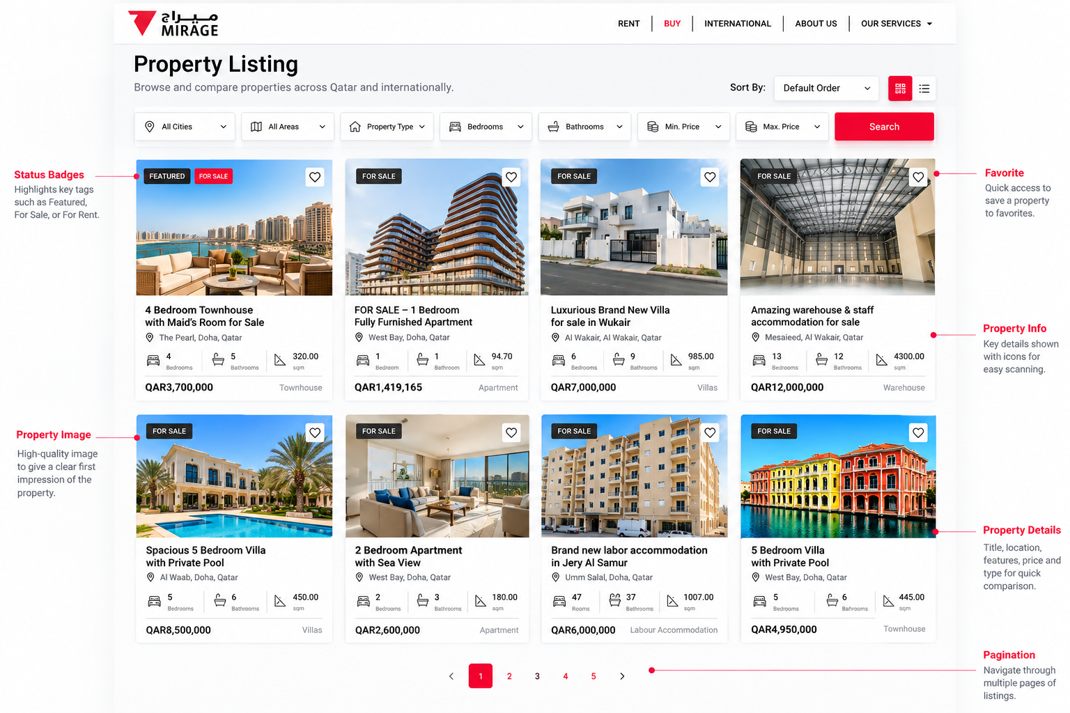
They scan multiple options, looking for signals that tell them whether a property deserves closer attention. That meant the listing experience needed a clear information hierarchy.
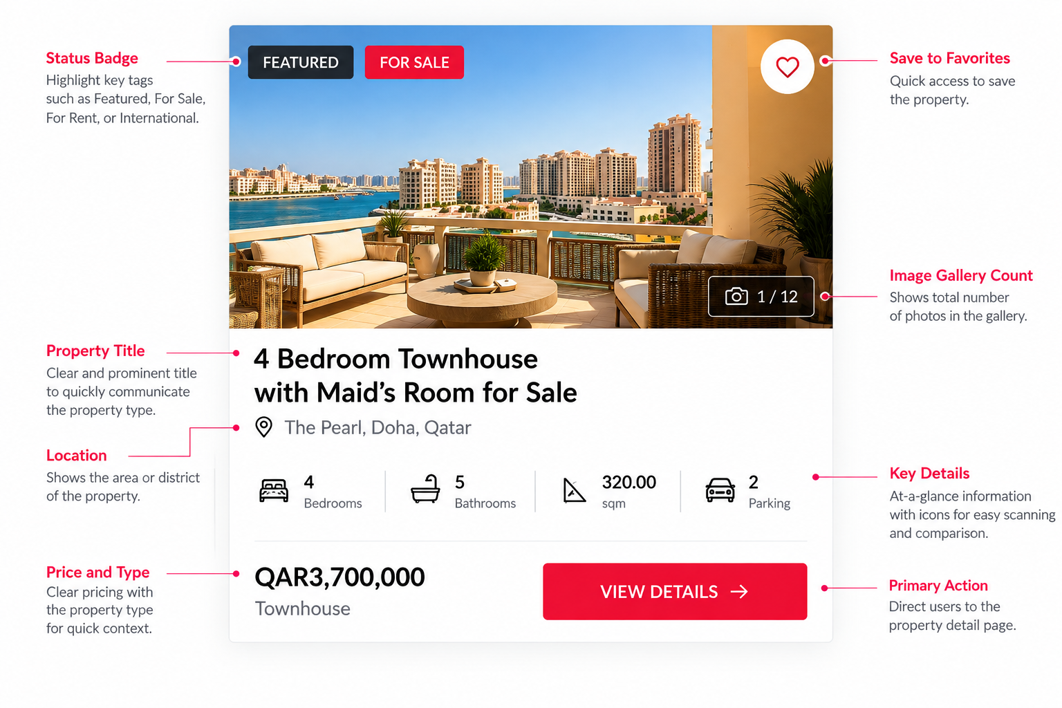
Rather than treating every piece of information equally, I prioritised the details that help users make that first decision: property imagery, location, price, property type, bedrooms, bathrooms, and size.
The goal was to give users enough information to answer: “Is this worth looking at?” before asking them to process the full property listing.
This made browsing faster while keeping detailed information available when users wanted to explore further.
Decision 3 — Support Exploration by Location
Not everyone begins with a precise search.
For many people, particularly those exploring the Qatar property market, where they want to live is part of the discovery process itself.
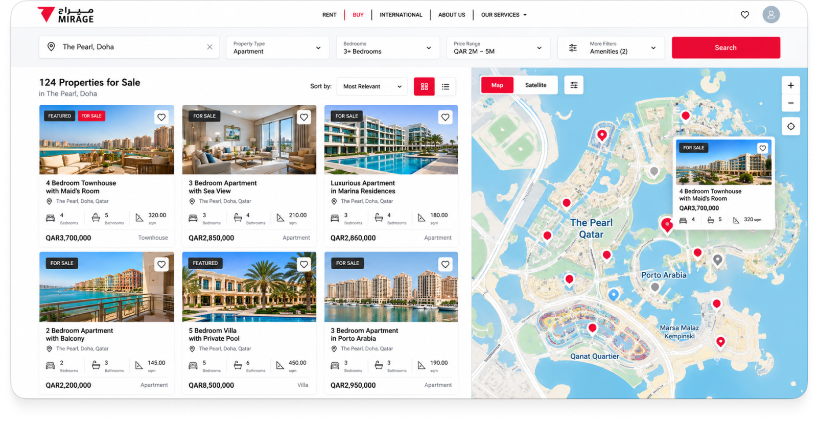
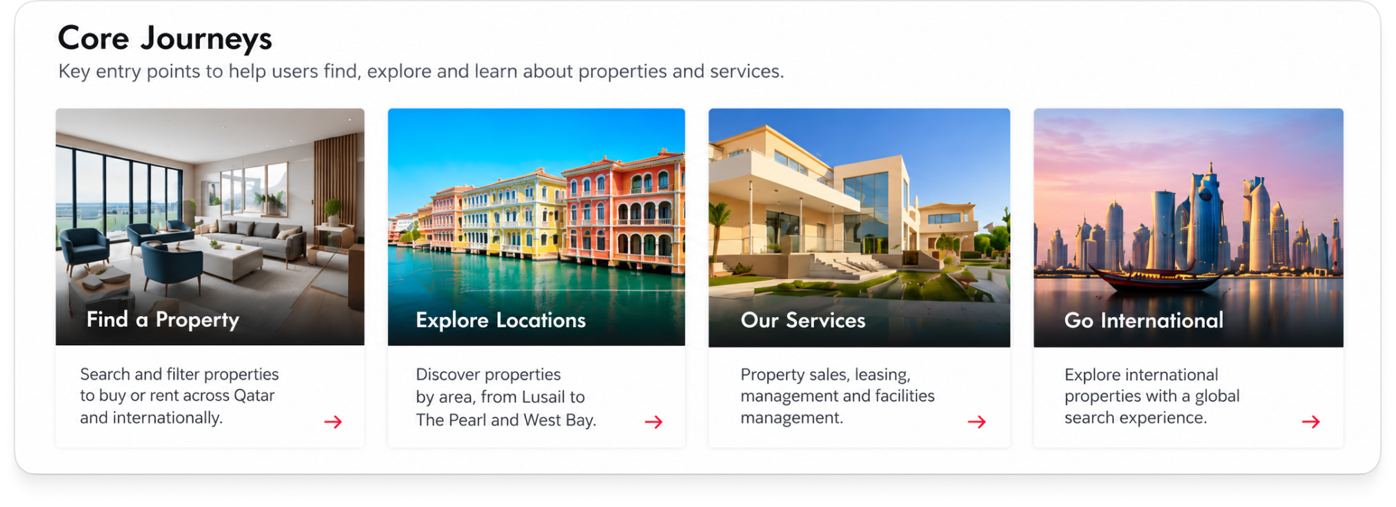
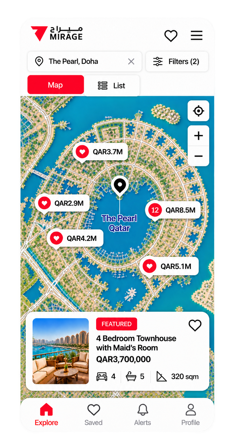
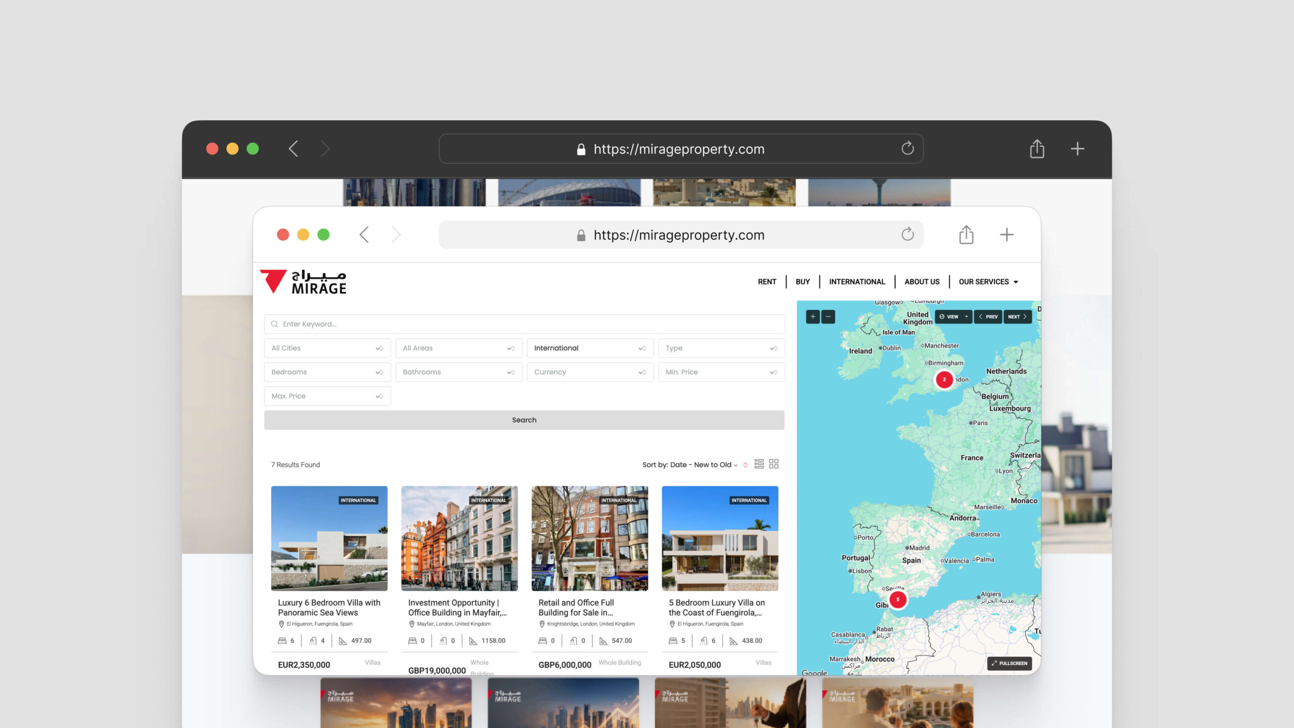
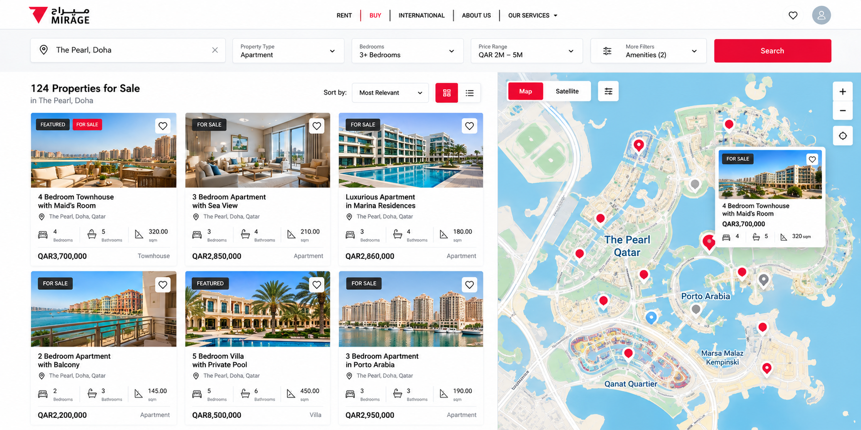
The experience therefore also supported location-led browsing, allowing users to explore properties across different areas rather than relying entirely on search filters.
This created two complementary paths through the product:
I know what I want
→ Search and filter
I’m exploring what’s available
→ Browse by location
This allowed the experience to support both goal-oriented users and people who were still discovering what different areas had to offer.
Decision 4 — Help Users Move from Discovery to Decision
Finding an interesting property is only one part of the journey.
Users also need to evaluate their options and decide what deserves further attention.
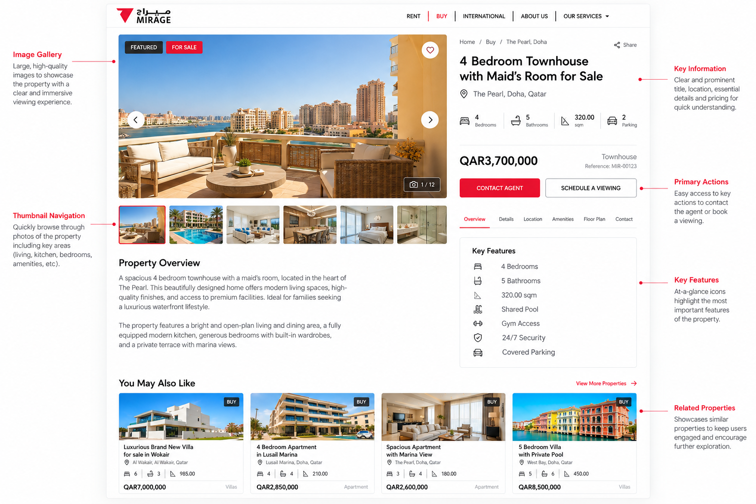
The experience therefore connected property discovery with the next stages of the journey, giving users ways to explore individual listings, compare options, and ultimately contact Mirage or arrange a viewing.
The aim was to create a clear progression:
Discover → Narrow → Evaluate → Enquire
rather than treating each listing as an isolated page.
How I worked
The project was highly collaborative, with me working between the client and our engineering team throughout the process.
I began by working with Mirage to understand their business, requirements, and expectations for the new website. I translated those requirements into the structure and UX of the product, then developed the interface and interaction patterns needed to support the property discovery experience.
Throughout the project, I presented work to the client, gathered feedback, refined the designs, and worked with engineering to resolve implementation questions and technical constraints.
As Project Manager, I also kept the different parts of the project aligned through delivery. Having responsibility for both UX/UI and project management allowed me to make decisions with the full picture in mind — user needs, business requirements, technical feasibility, and delivery.
Core UX Features
Property Search & Filtering
Multi-criteria search designed to help users narrow properties by location, property type, status, bedrooms, bathrooms, and price.
Property Details
Structured property pages that prioritise key information, imagery, specifications, and clear paths to enquiry or viewing.
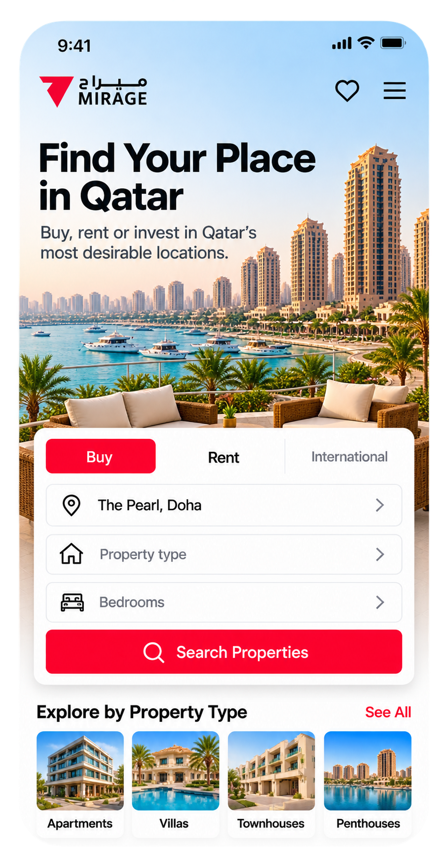
Property Discovery
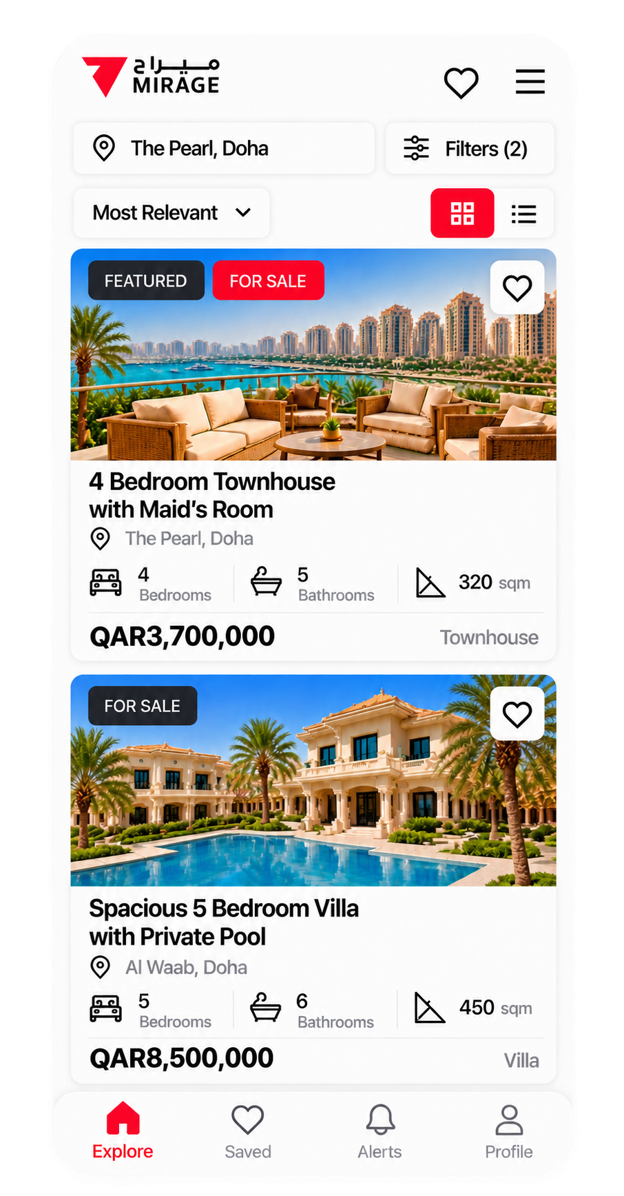
A visual browsing experience that helps users scan available properties quickly and explore options across different locations and property types.
Location-Based Exploration
Dedicated location experiences that allow users to discover properties by area, supporting users who are still exploring where they want to live.
The Product Today
Nearly a decade after the original project, Mirage Property continues to operate its digital property platform across Qatar.
Today, the platform supports:
200
properties currently listed across Qatar
170
apartment listings
8
core search dimensions
7
key locations highlighted for property discovery
UI & Visual Language
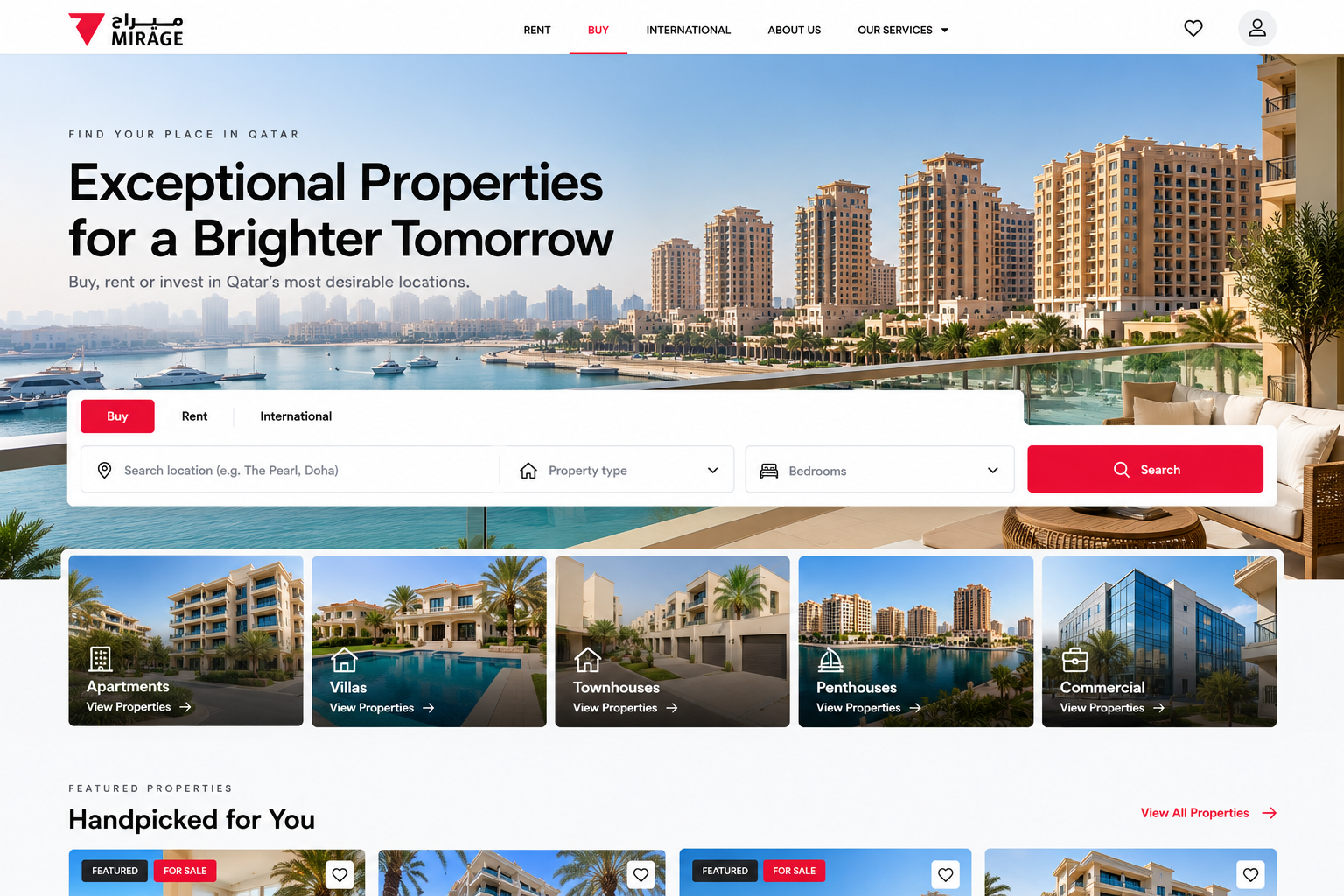
The visual language was designed to make a content-rich real estate experience feel light and easy to navigate, while allowing property photography to take centre stage.
A predominantly neutral palette keeps the interface clean and understated, while Mirage Red creates a distinctive brand accent and draws attention to key actions. Generous white space and clear hierarchy help organise a large amount of property content without making the experience feel crowded.
Copy Voice
Clear, concise, and aspirational.
The copy balances the practical information users need when searching for a property with a more lifestyle-oriented tone around discovery. Direct labels and calls to action keep the experience easy to navigate, while messaging such as “Find Your Dream Home” brings a more aspirational quality to the brand.
Mirage Red
A bold brand accent used selectively for primary actions, highlights, and interaction cues.
Charcoal
Creates strong contrast across navigation, headings, buttons, and key information.
Soft Gray
Provides subtle separation between content areas and supports secondary interface elements.
White
The primary canvas, giving property photography and information room to breathe.
WHAT I LEARNED
Simplifying complexity doesn’t mean removing it. Understand the complexity behind the product. Surface what matters first. Reveal the rest when it becomes useful.
Mirage was an important project in developing how I think about complex digital products. Property decisions involve a lot of information. The solution isn’t necessarily to remove that information — users genuinely need it.
The design challenge is deciding what matters at each stage of the journey.
During discovery, users need enough information to narrow their options. During evaluation, they need more detail to compare them. And when they’re ready to act, the next step needs to be obvious.
Mirage also gave me valuable experience owning a project beyond the interface itself. Working directly with the client while collaborating with engineering taught me how closely user needs, business requirements, technical constraints, and delivery are connected.
That way of working has stayed with me throughout my career and later became central to how I approach complex SaaS, enterprise, and healthcare products.