
Intro
As the designer behind DataInTrans, I set out to create more than just a telematics platform — the stakeholders wanted a tool that empower users with clarity, confidence, and control over their operations. I was brought in to design a system that could turn real-time tracking data into meaningful, accessible insights — for operators, fleet managers, and field teams alike.
My goal: create a data-rich interface that feels lightweight, actionable, and trustworthy — even under operational pressure.
Every screen, every interaction, and every metric is crafted with purpose: to make complex fleet and asset data intuitive, actionable, and beautifully accessible.
Role
Product Design, Branding, UI/UX Strategy, System Design
Client
Data InTrans Pty. Ltd.
The Challenge
Fleet managers relied on fragmented, complex tools that were hard to customise and slow to respond. DataInTrans needed to unify safety, tracking, and cost management into one intuitive, powerful platform.
My Approach
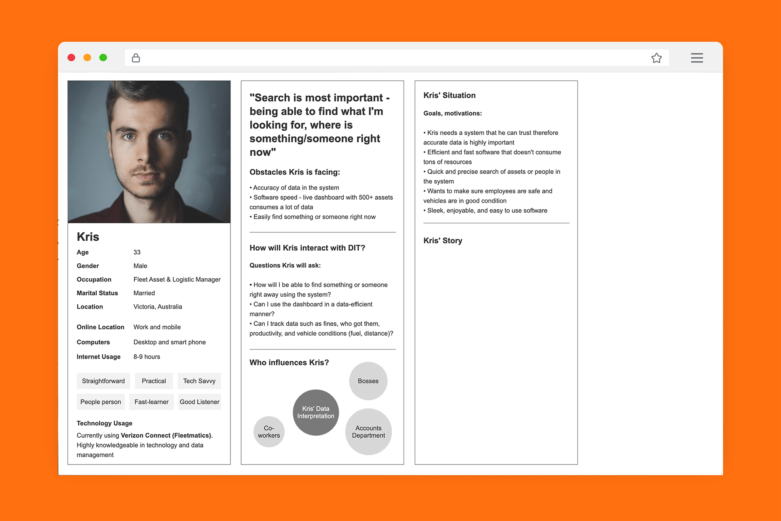
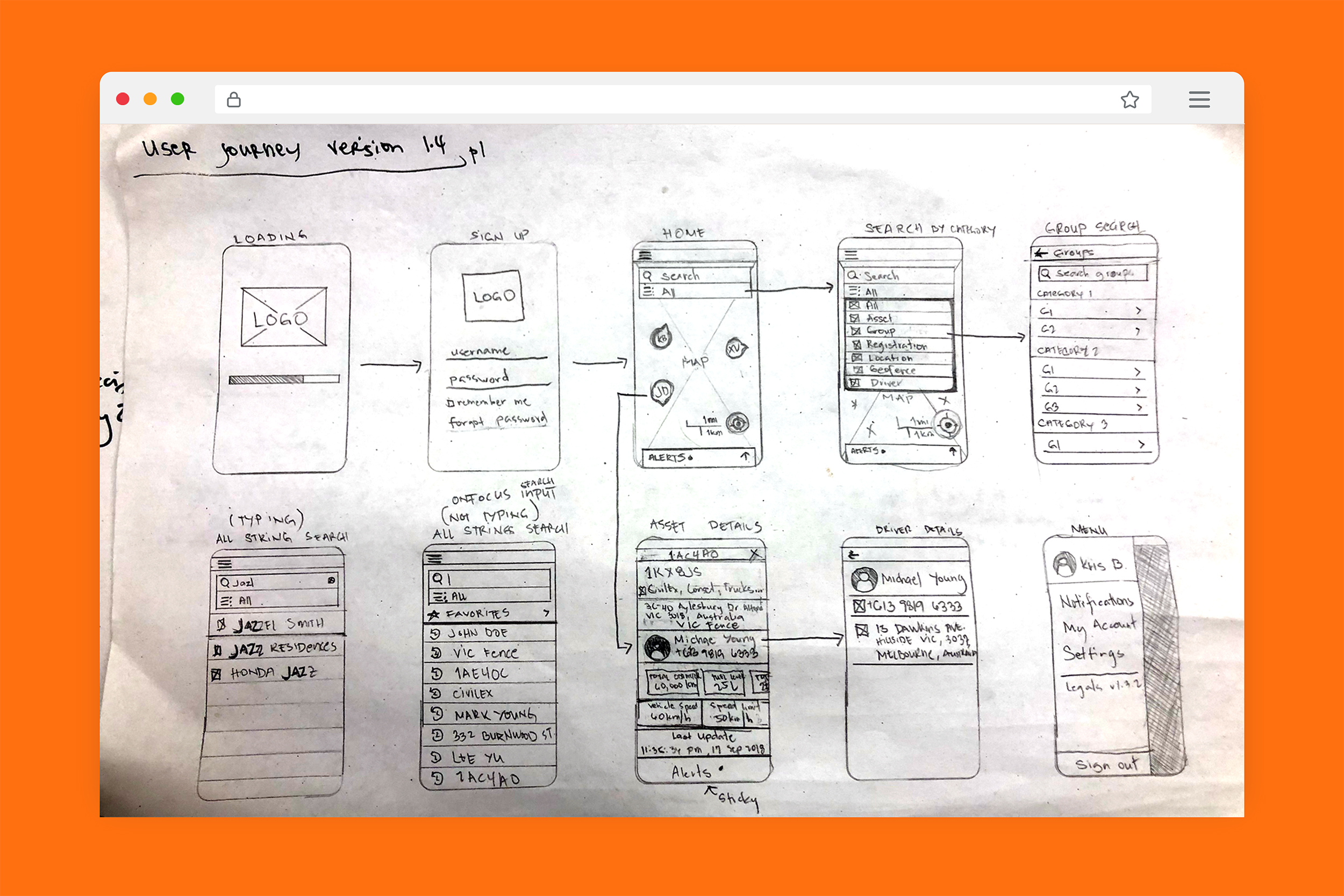
I applied a user-centered design strategy built on clarity, trust, and control — surfacing what matters, supporting real-time decisions, and turning insights into action.
Key UX Areas
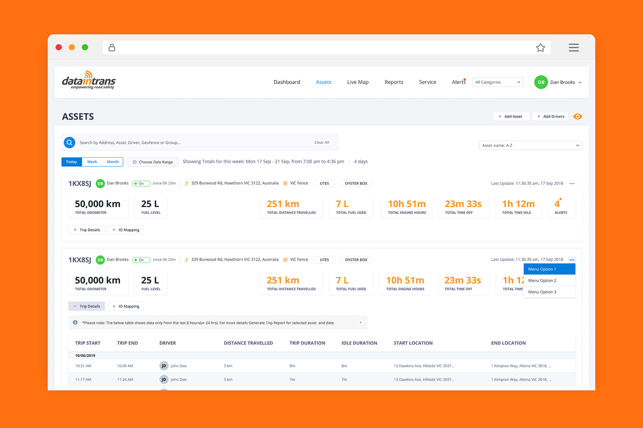
Dashboard & Asset Overview
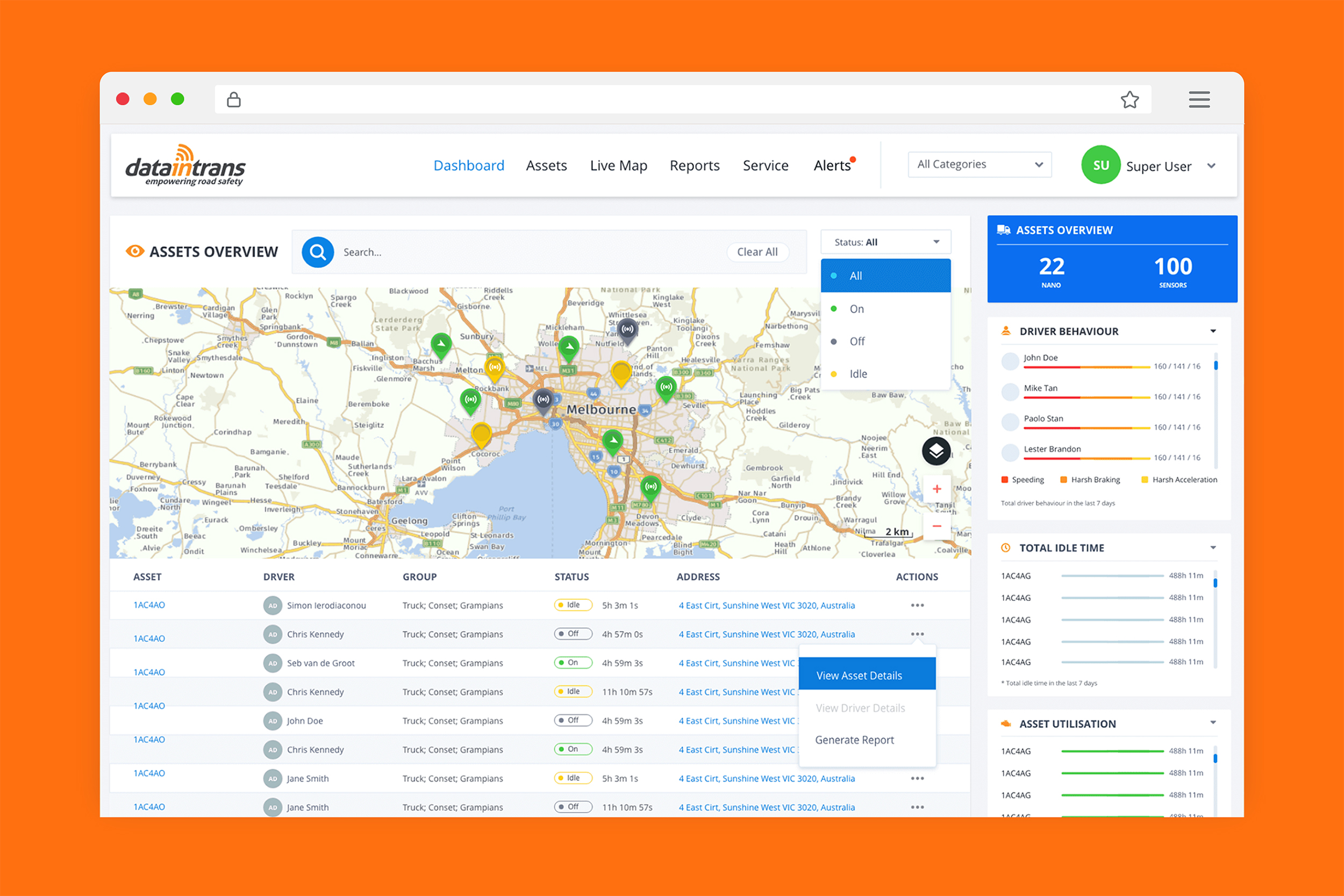
A clean, customisable dashboard provides a 360° view of operations. Users can quickly act on real-time insights through modular widgets and smart defaults.
-
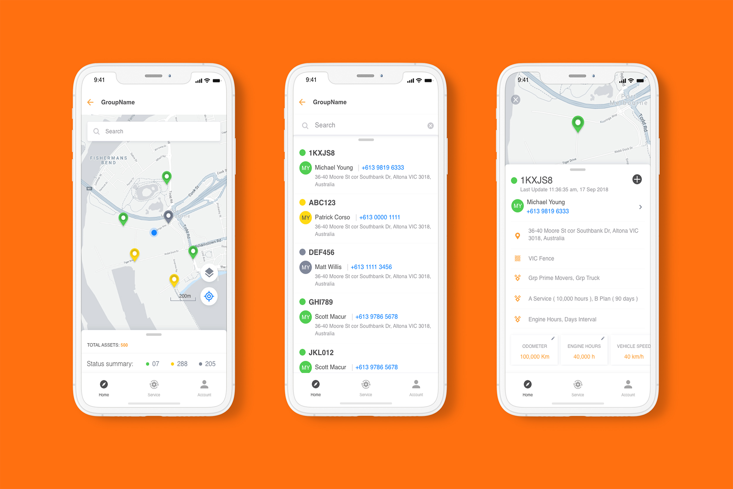
Live operational map with high-res overlays
-
Asset and driver timelines
-
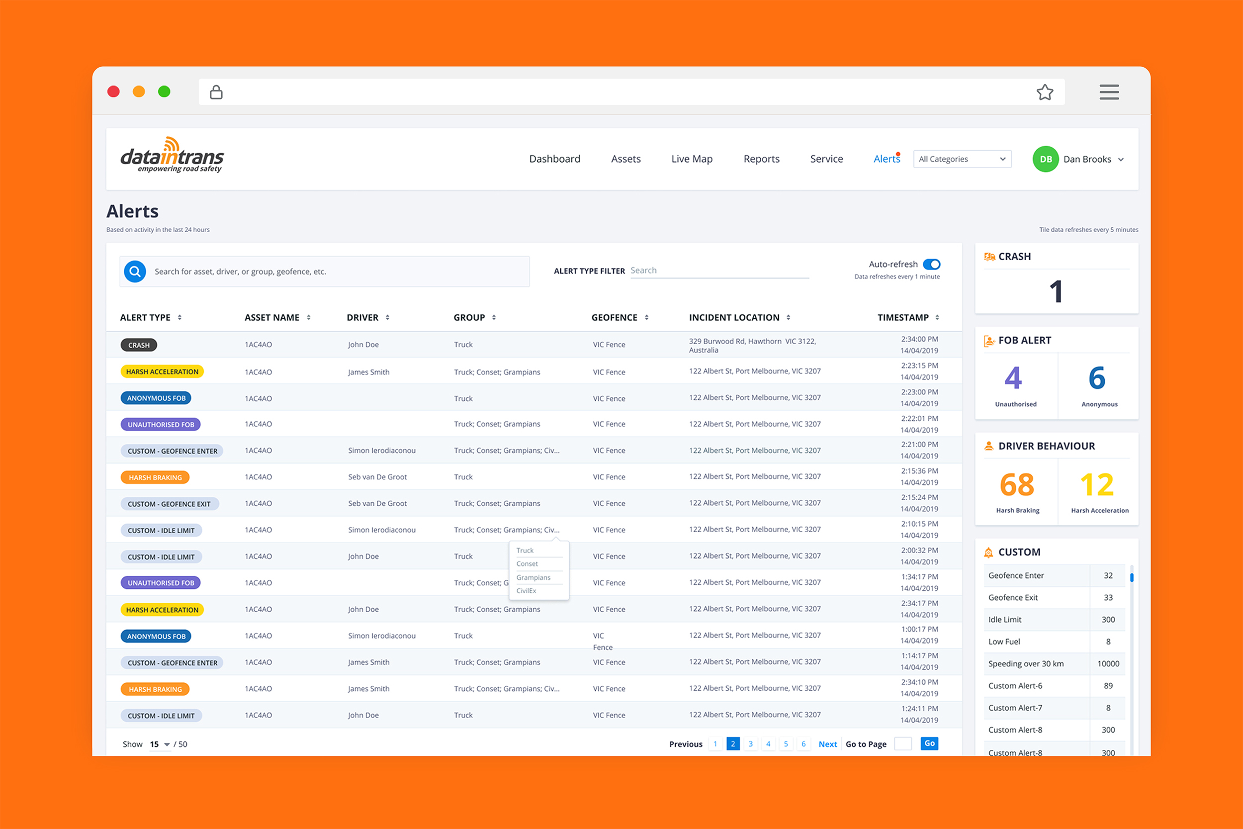
Custom alerts for behaviour, environment, and movement
Driver Safety & Feedback
Designed safety tools that support proactive coaching, not punishment — keeping drivers safer and fleets compliant.
-
Behaviour scoring and trends
-
In-cabin feedback UI
-
Live alerts for fatigue, seatbelt use, and harsh events
Cost Reduction Tools
I focused on visualising key inefficiencies to help teams reduce waste and improve ROI.
-
On/off-road fuel tracking
-
Idle time and usage analytics
-
Component monitoring to avoid costly repairs
Asset & Equipment Monitoring
Built features for full visibility into asset condition and performance — even across remote or rented equipment.
-
Impact and tamper alerts
-
Environmental monitoring
-
Predictive maintenance diagnostics
UI Design and Visual Language
I chose a color system that reflects the platform’s mission:
-
Orange for action, urgency, and safety indicators
-
Gray for a clean, modern foundation
-
Blue to reinforce trust, technology, and calm
Typography, spacing, and layout were deliberately designed to reduce cognitive load — even on complex screens.
Orange – Action & Alerts
Used sparingly to draw attention to key actions, warnings, and performance indicators. It energizes the UI and prompts user engagement.
#f47b11
Gray – Structure & Clarity
Provides a clean, neutral foundation. Gray supports readability, reduces visual fatigue, and keeps the interface feeling modern and professional.
#767e8d
Blue – Trust & Technology
Blue communicates reliability and stability. It anchors the interface, highlights data insights, and reinforces the app’s technical credibility.
#007aff
UX Copy Philosophy
- Direct but reassuring (“You’re up to date” vs. “No new alerts”)
- Contextual (“This driver needs a rest break”)
- Actionable (“Schedule maintenance now”)
My goal: reduce ambiguity and help users act with confidence.
Outcome
By unifying safety, tracking, and cost data into a single interface,
DataInTrans gave fleet operators something they didn’t have before — a clear, real-time picture of their entire operation in one place.
Clarity at a Glance
Unified safety, tracking, and cost data into a single real-time dashboard — reducing the cognitive load of monitoring multiple assets simultaneously.
Safer Operations
Moved driver safety from reactive reporting to proactive coaching — aligned with industry benchmarks showing a 10% safety score improvement reduces preventable accidents by up to 8%.
Lower Costs
Fuel and idle-time visualisations made inefficiencies immediately visible — telematics platforms like DataInTrans benchmark 15–20% fuel savings and up to 30% reduction in idle time.
Built to Scale
Since launch, DataInTrans has rebranded as Smartquip — expanding into AI-powered fleet intelligence, gate OCR, and port logistics across Australia. The platform grew well beyond the original brief.
WHAT I LEARNED
Fleet management is a domain where the cost of a bad UI isn’t frustration — it’s a missed alert, a delayed decision, a preventable accident.
Designing DataInTrans taught me to think about information density differently: how much can a user process at speed, on a small screen, while managing a team? The answer is always less than you think. Every simplification was a design win.