
Intro
I led the product design for a scalable, end-to-end solution that replaces outdated, paper-based systems with a seamless digital experience — covering everything from online bookings and clinical workflows to payments, compliance, and real-time reporting.
What I did
Product Designer | UX Strategy | UI Design | Branding
The Goal
Create a platform that adapts to the entire Australian Immunisation System — whether it’s used by local councils, general practices, school programs, or mobile health teams — while making complex healthcare delivery feel simple, fast, and accessible.
The Challenge
Across Australia, immunisation services often rely on disconnected tools and manual processes that are:
-
Slow and error-prone
-
Difficult to scale
-
Resource-intensive for staff
-
Frustrating for patients and caregivers
Vitavo needed to unify these processes into one platform that serves the needs of diverse providers, while remaining compliant, intuitive, and cost-effective.
My Design Approach
My user-centred strategy focused on three pillars:
-
Simplicity – Reduce complexity at every touchpoint
-
Trust – Support safe, high-stakes workflows with clear UI
-
Scalability – Design once, adapt to many: councils, clinics, schools, aged care
Core UX Features
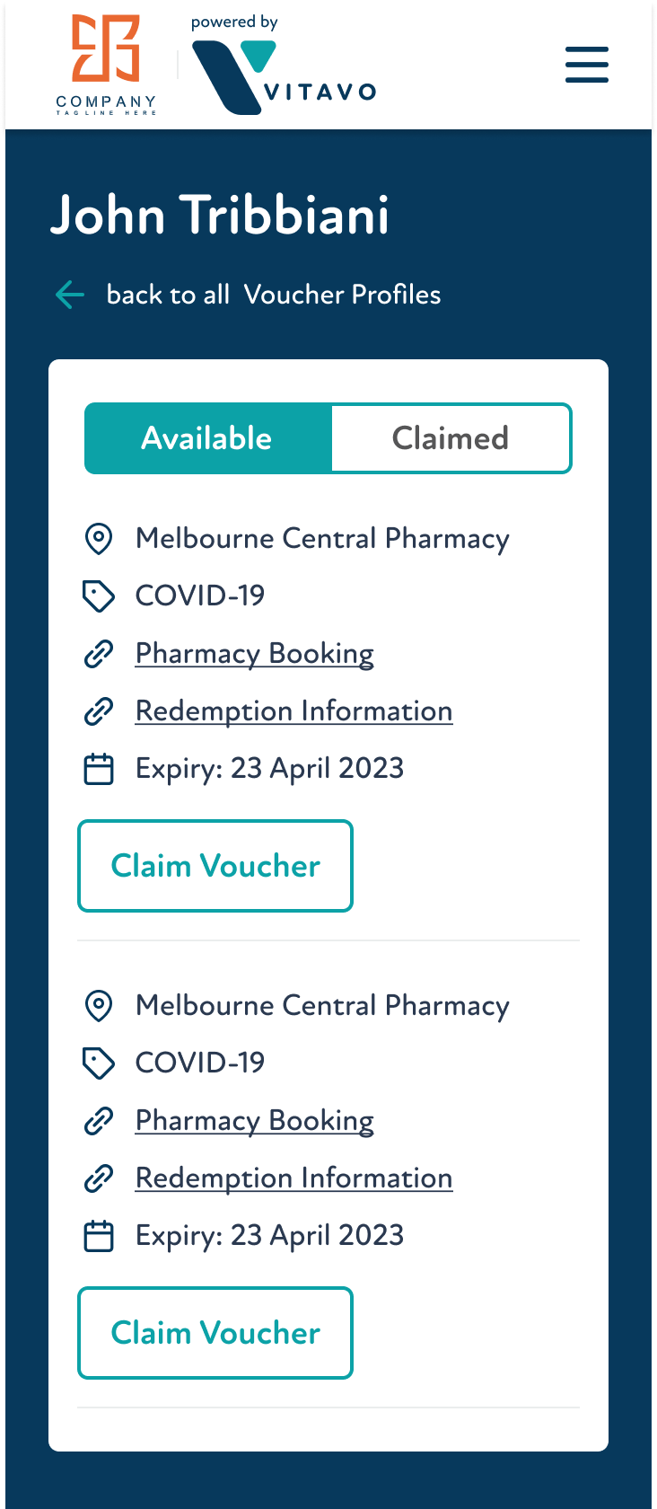
Smart Booking & Eligibility
A dynamic booking flow that adjusts to age, vaccine type, and program rules — ensuring fast, compliant scheduling.
Workflow Automation
Streamlined admin tasks and clinical steps for faster, error-free sessions — even in high-volume settings.
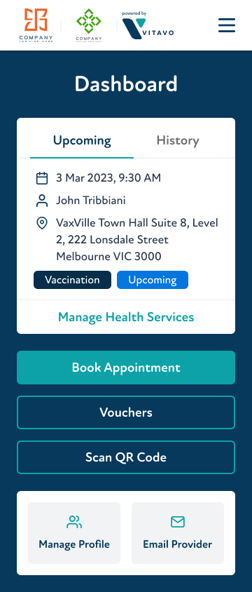
Real-Time Dashboards
Clear, actionable insights into vaccine uptake, session performance, and stock levels.
Notifications & Alerts
Proactive alerts for missing data, eligibility issues, or capacity limits — reducing risk and delays.
Project stats
90
of admin tasks automated, appointment time cut from 10 mins to under 1
15
vaccine revenue per site, 30–40% reduction in annual operating costs
30
providers - supports schools, councils, GPs, and mobile clinics
1,145
ROI — every $1 returned $12.45


UI & Visual Language
Vitavo’s design supports clear, confident decisions under pressure. Using neutral greys with accents of bright teal for guidance, soft coral for urgency, and deep navy for emphasis, the interface is calm, focused, and accessible across local governments, clinics, and workplaces.
The product voice is equally clear and instructional, guiding users with concise messages like:
- “Eligibility confirmed.”
- “Next patient ready.”
- “Consent form incomplete – action required.”
Together, the visual and verbal tone create an intuitive, reassuring experience for high-stakes workflows.
Deep Navy
#07395C
Bright Teal
#0CA2A7
Soft Coral
#FC8484
WHAT I LEARNED
Design solves. Art expresses. In systems that impact lives, clarity always comes first.
Designing for a live, national healthcare system taught me how to build tools that are simple on the surface but powerful underneath. I learned to prioritise clarity under pressure, design interfaces that adapt as data evolves, and empathise with users who don’t have time to “figure it out.”